Virgin Media is a telecommunications provider offering broadband, TV, mobile, and landline services across the UK through its own fibre-optic network.

The problem
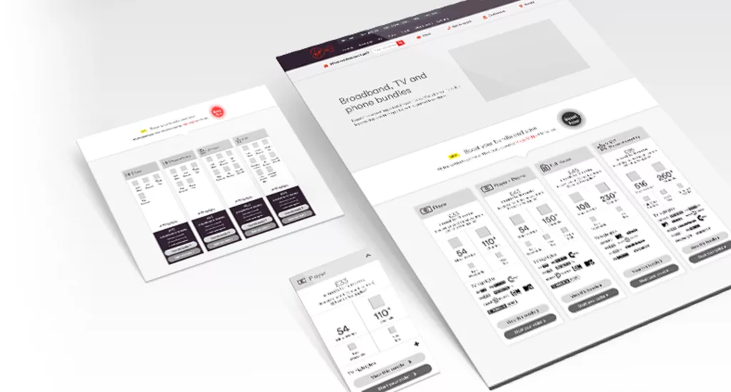
The bundle comparison page is the top entry page for users landing on the Virgin Media website, accounting for around 25% of all visits. This meant that it was crucial to have a page that performed well and provided users with the information that they needed. The existing page was incredibly content-heavy, and the way in which this was presented made it incredibly difficult for users to compare each package and understand which bundle best suited their needs. Users found the amount of content on this page overwhelming and often struggled to progress through their journey. In order to fully understand the problems that users were facing, we took this opportunity to collate all existing research that had been conducted, as well as engage with other departments across the business to ensure that a consistent experience was delivered across all touchpoints.

UX Challenge
Users had long complained about the difficulty in being able to easily compare the different packages available to them. The existing layout was heavy on content and users were overwhelmed by the amount of information that they were presented with.

UX Goals
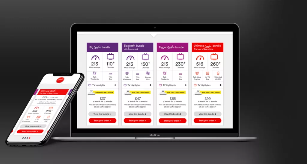
Create a simple, user friendly component that allows users to quickly understand the differences between Virgin Media’s bundle products. The component should allow us to create a standardised approach that could be used across all product comparison pages.

Mobile First
Almost 60% of visitors to this page were using mobile devices, so optimising the experience for mobile was crucial. Historically, components had been designed for desktop devices which resulted in a poor experience for users on Mobile and Tablet.

Discovery.
As the only UX designer on this project, I initially conducted thorough competitor research, whilst also reviewing heatmaps in order to understand user behaviour. This, combined with previous user interviews that had been carried out, highlighted that users were not engaging with the page content and were struggling to find the information that they were looking for.
Design.
Following the initial discovery phase, a series of low-fidelity wireframes were created and shared with a small group of users. Feedback was then reviewed and wireframes were amended accordingly until two optimised, high-fidelity designs were created and shared with a larger group of users.
Deliver.
The optimised experience was then launched as a multivariate test in order to gain some quantitative data. The test ran for a period of 4 weeks until the result reached statistical significance of 98%. Following the conclusion of the test user behaviours were analysed in order to identify opportunities for future iterations.
Takeaways.
The improvements made to the bundle comparison component has allowed users to quickly and easily compare the features of all of the TV, Broadband and Phone bundles that are on offer, regardless of the device they are browsing on. This has resulted in a conversion uplift of 4.35% across all devices, which translates to 341 additional orders per month and £700k in additional yearly revenue for the business. The next steps will be to review user behaviour in order to optimise performance, particularly on mobile and tablet devices and to also optimise micro-interactions, creating an experience that truly delights users.